04.11.24 / Daniel Ibbotson
CGI Fridays
Our experiences in the space between CGI and Photography.

We’ve worked with CGI on quite a few projects recently and I must admit I felt slightly conflicted about it at first, although really it’s hard to justify why. I have a background in photography (and some of my best friends are photographers)! I wonder if I feel like a photograph is somehow more honest or real.
It is more real, in a way. The things in the photograph were there in front of the camera. Usually at least. 'A camera never lies' is simply not true though. Anyway, a computer generated image is no less real than any other of the visuals I produce daily. It’s an odd one. Maybe it’s just a complex hang-up based on all of the ridiculous ‘feelings’ that people have had over the years about anything that’s made using a computer, especially if that thing is in the realm of ‘art’. Even I, as a designer who uses computers, and an electronic musician, who uses computers, I am apparently not impervious to the nonsense.
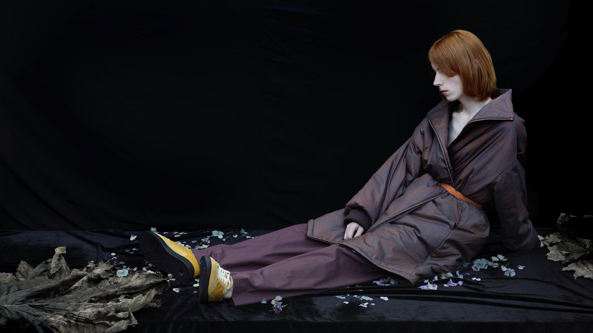
It’s getting more and more difficult to spot a computer generated image, especially as more and more ‘real’ photographs get significantly ‘enhanced’. The line between the two is becoming finer. Some might say it’s the human form that really sets CGI imagery back but just look at these portraits by Ian Spriggs.
AI imagery is a different thing but this isn’t about that.
So why did we work with CGI artists rather than photographers on these projects? Well, just like any creative job there is a right way to go and that is based on a whole myriad of considerations.
What is being expressed? Do we create illustration, photography, CGI, or is it a typographic project? If the photographic image feels like the right medium then what will the images be like? what will they ‘say’? and who will we work with to create them, who has the right style, approach and personality?
Over the years we’ve got to know and have worked with quite a number of great photographers all of whom are very capable indeed and at least a couple of them would have been more than up to the task of the first of the projects I’ll talk about.
Oaktree
Oaktree are based in Bangalore, India, and they design and make high-end bespoke kitchens and wardrobes. We worked with Oaktree on an extensive, ground up re-brand, We looked at everything from strategy, brand ID, uniforms, liveries, collateral, social, website and content.
This very quickly became a logistical nightmare. In order to pursue a photographic route then Oaktree would need to have the space to build all of these set ups in such a way that when photographed they looked at least a bit like homes. This alone would require a lot of physical space and great expense. Also we knew we wanted to work with natural feeling light in the images, this again would place further requirements on the space, access to daylight in a controlled way for each of the set-ups. Then factor in the costs of styling each of these spaces, travel and accommodation for the art direction and photographic team.
Not that creating these images via computer visualisation was a compromise in any way. Quite the opposite. Given what we were looking to achieve it was by far the best option. Allowing us infinite control over the scenarios, the light, the angles, the lenses, the props and styling.
Every aspect of each image was tweakable. Also we were keen to introduce some moving image and again this came with the exact same set of advantages plus a whole load of additional ones to do with equipment, space and so on.
Hunts Office
Another project, for Hunts Office, simply required things that would just have been really, really hard to do using photography or film. This project was kind of conceptual, in a way trying to expand on the idea of the creativity of furnishing a space, the burst of ideas that are formed into a completed project.


There are certainly some similarities here to real world filmed projects like the Sony Bravia ‘Balls’ ad, with all the coloured balls bouncing through San Fransisco. (Although, how much of that was real)?
Of course we didn’t have Sony budgets but even if we did this concept would have been hard to realise in the real world. So CGI made sense. Again it gave us infinitely tweakable scenes, angles and lighting. The hyper-real almost illustrated aesthetic we wanted to achieve was much simpler.
Of course it’s great to have excellent teams like Where Giants Roam to work with on projects like this. True creatives who are keen to push the boundaries of what they can do for the sake of the project. It’s just the same as working with any other kind of creative, an illustrator or a photographer.
A meeting point for ideas that make a tangible difference for our clients.

Next article


