13.03.25 / Daniel Ibbotson
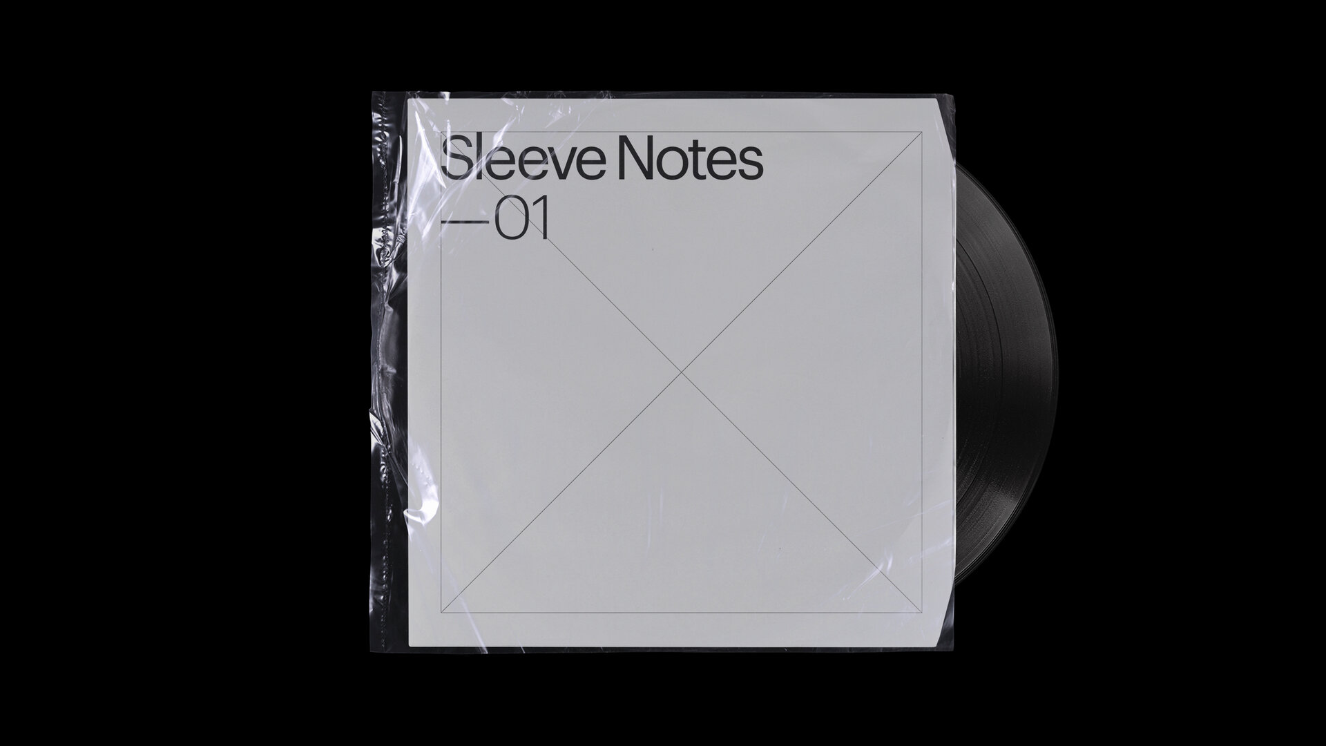
Sleeve Notes
The premise is simple. A selection of record sleeves that have, in some way, influenced the writer...
...
of course it’s a play on words as well, ‘sleeve notes’ being the messages about a recording contained within the artwork itself.
First up, just to get the ball rolling, GH Creative Director Daniel Ibbotson.
"
Ten sleeves, in the order they came to me rather than the order they were released. I could have picked some cooler examples, but that's not really the point.
Daniel made a record recently, find out more about that here.
01
Brothers in Arms
Dire Straits
Cassette
Warner Records
1984
(Thomas Steyer & Deborah Feingold)

01
Probably like a lot of designers I first became aware of design through music. My Dad had a couple of volumes of ‘The Album Cover Album’ a soft-cover book of record artwork, mostly from the 60s, 70s and 80s. I would pore over these for hours. The Rolling Stones, Sticky Little Fingers, Bob Dylan. Not that I knew very many of the records but there was something about the sleeves, the simplicity of the square images, that really appealed. I think the first that I really connected with in real life was the ‘Brothers in Arms’ album by Dire Straits. On cassette.
I must say I don’t think this is a great piece of design by any measure but it is iconic and powerfully transports me to a very specific time of my life. I would have been 11 years old and on holiday with my parents, driving around the Scottish Highlands and Islands, staying in B&Bs. The first line of the title song ‘These mist covered mountains’, still brings a vivid image of literally driving through mist (rain) covered mountains, an incredibly literal experience but one that is firmly lodged into my brain. I cannot see this cover (be it cassette, CD or LP) without being taken back there.
02
The 12” Album
Howard Jones
Cassette
WEA/Elektra
1984
(Hiro Itoh)


02
This is a bit of a daft one really. I think it was the first album I bought, again it’s on cassette. I was really getting into synthesisers at this point (maybe 13ish) and I loved the warm tones of this music. The instrumental breakdown in the middle of ‘What is love’ is still an absolute killer and I challenge anyone to prove otherwise. Anyway, there are a couple of amusing things here from a design perspective.
Firstly I had absolutely no idea what a 12” was at this point in my life, it did strike me that all the tracks were really long, but the notion of an extended 12” remix had not yet crossed my horizon. When I did become aware of the format it struck me how ridiculous this sleeve is, on cassette at least. Depicting a ruler measuring 12” (that’s 300mm in real money) I get how this works on an LP, however a cassette box is around 102mm high, and squared off the image is probably only around 65mm. A lesson to consider those multiple formats.
03
Psychocandy
The Jesus & Mary Chain
LP
Creation Records
1985
(Greg Allen)

03
When this was released it was the coolest thing I’d ever seen or heard. There was literally nothing that looked or sounded like this and it opened the door to so much other music for me. I had it on cassette at first then bought it on vinyl as soon as I got a turntable. Art Directed by Greg Allen with a bewildering number of people credited for the image, a still from a video, the sleeve combines video, photography and typography in such a powerful way. Perhaps the first time I’d really thought about the idea of ‘typography’ (although I’m sure I didn’t call it that)! The paired back colour palette, the combination of extended and condensed faces, the reversed N, the repetition, the odd composition. Kind of simple, but not really.
Side note, it was actually my Dad that got me into this when he taped ‘Some Candy Talking’ off the top 40 show on Radio 1, Sunday night.
04
You Made Me Realise
My Bloody Valentine
12” EP
Creation Records
1987
(Geoff Stoddart)


04
Finally a piece of vinyl. This is the first actual record I bought. I was 15 years old maybe, 87 or 88. I remember taking the bus into Derby (I lived in a tiny village in the middle of Derbyshire) and buying this (from the brand new store BPM Records which had THE coolest carrier bags and by far the best selection of new music). The sleeve is fairly unremarkable from a design perspective but it’s a very strong image. Taken by photographer Geoff Stoddart of a friend of the band, Melanie, the image references a 1923 photograph by Edward Steichen called ‘The Blue Sky – Dana’. However what struck me beyond this was the tactile quality of the record. The image is printed on the reverse of the board, the sleeve is essentially inside out, rough and toothy feeling, the ink feels like it’s soaked in rather than sitting on top. A fairly common practice these days but at the time it felt so different and was probably the first time I thought about design as being something beyond how an object looked.
(BPM is still trading, is still run by Dave Hill who started it, and is still a great record shop).
05
Ultra Vivid Scene
Ultra Vivid Scene
LP
4AD Records
1988
(Vaughan Oliver/V23)

05
Designed by Vaughan Oliver, who created more or less all the sleeve art for the 4AD labe. I could have picked any number of examples here, his body of work is extraordinary. Pixies, Cocteau Twins, The Breeders, This Mortall Coil, Throwing Muses, the list is long and spectacular. This sleeve in particular leads on from the previous example, again triggering an awareness of the record as object. If you think about it a record is only just three dimensional, maybe having 3mm depth for a fully packaged single LP. But Vaughan Oliver was thinking about the tactile experience in a different way. Long before Apple perfected ‘unboxing’ he knew that the process of touching and revealing the layers of a record were almost as important as the music. This particular sleeve features embossed tape texture and metallic ink to enhance that trompe l’oeil effect. Many of his sleeves featured more complex formats or extensive inner booklets, all adding depth and context to the music and to the ritual of the experience for the listener.
06
Power, Corruption & Lies
New Order
LP
Factory Records
1983
(Peter Saville)


06
There was always going to be a Peter Saville. Not the obvious choice from the Joy Division/New Order/Saville back catalogue but arguably the finest. The sleeve is almost entirely a reproduction of the painting ‘A Basket of Roses’ by 19th Century painter Ignace-Henri-Théodore Fantin-Latour. A fitting image for the dark, machiavellian themes of the record. The only ‘design’ we see on the cover are a series of coloured squares in the top right corner. No band name, no album title. I love this confidence. In a world where everyone wants everything to be bigger, brighter and louder this kind of restraint is actually the loudest of all.
The coloured squares are not just decoration, they are a visual code devised by Saville. Used on other records – New Order’s 'Blue Monday' 12” for example – in this case the code doesn’t even represent the band or title, just the catalogue number, FACT75. The reverse of the sleeve features a floppy disk style cut-out, very similar to the infamous ‘Blue Monday’ sleeve and a decoder for the coloured blocks, for those that are interested. I love this too, sleeve notes are traditionally the realm of the enthusiast, this takes that idea to the next level.
07
Amber
Autechre
CD
Warp Records
1994
(Ian Anderson/TDR/Nick Mears)

07
Much like the relationships between 4AD Records with Vaughan Oliver and Factory Records with Peter Saville, Warp Records had a similar arrangement with The Designers Republic (TDR). Both Sheffield based companies really putting the north on the map in the 90s. TDR certainly had quite a distinct style and approach at this time, one that you can still see echoed in the practice of some of their alumni to this day. These kinds of ongoing collaborations between labels and designers seem to yield amazing bodies of work, especially as relationships with artists and their music build over time.
What I love about this sleeve though is actually the opposite of what TDR were known for. If you don’t know them, Autechre make fairly abstract, sometimes abrasive, electronic music, not club techno by any means, not dub-step, not drum and bass. They just make music that sounds like Autechre. Previous sleeves had this edgy visual quality, glitchy, technical, information overload, but here Ian Anderson of TDR took a step back and did something completely different. Again the sleeve is mostly image, a photograph of sandstone cliffs taken by Nick Meers in Cappadocia, Turkey. At first it looks computer generated, perhaps because of its context on the cover of this kind of record. There is a calmness to the image that overflows and colours the music and there is a sense of the depth of slow time, hinted at by the title ‘Amber’. A refreshing change in the genre.
08
What Does Your Soul Look Like
DJ Shadow
CD Single
Mo Wax Records
1996
(Ben Drury?)

08
By this point CDs have taken over and, let’s be honest, for the most part they aren’t very nice as objects. Label Mo Wax, founded by James Lavelle, sought to change that with a series of albums and singles on CD that were considered to the same extent as a fine piece of vinyl. The first was probably the ‘Headz’ compilation, a double CD in a card gatefold wallet and a gatefold vinyl sleeve, just like a classic LP. The singles were the most interesting though, taking what felt like a throw away format and elevating it with quality design, materials and design.
The ‘What Does Your Soul Look Like’ EP by DJ Shadow was the first of these. So simple, just a card envelope where the flap was the full size of the CD, it totally changed the experience. Immediately there were layers to the object, a narrative to the design and imagery. Again very little in the way of information (this is becoming a theme) but this just added to the recording, a mysterious 45 minute long track in four parts. There were many CD singles in this series, for artists like Keyboard Money Mark, Attica Blues, Sam Sever, Luke Vibert, Rob Dougan, DJ Krush, Andrea Parker, each in their own unique format. A great collection, kind of hard to come by now though. Cardboard doesn't last as long as plastic.
09
Ladies & gentlemen we are floating in space
Spiritualized
CD
Dedicated Records
1997
(Mark Farrow)


09
Another incredibly fruitful long-term label/designer relationship between Mark Farrow and Dedicated Records and another unique take on the CD format. Spiritualized are well known for their drug infused subject matter, this connection is taken to the extreme with the packs for this album. Even in its most basic form the CD version of the album came packaged like a huge tablet, in a box that felt very pharmaceutical, containing an extensive folded information sheet printed in a single colour on flimsy paper with tiny type and a large foil blister-pack. You had to break the foil on the blister-pack to get to the CD, essentially ruining the packaging and devaluing the object. Potentially a stroke of marketing genius? Would fans buy two copies so they could keep one un-opened? The pack certainly represents an experience very evocative of the themes of the album.
There was also a limited edition version of the album where the tracks were split across six 3” CDs creating something even more like a massive box of paracetamol! In 2009 the band re-issued the album with twelve 3” CDs in two blisterpacks and two standard sized CDs of bonus content, all in black. I have one of these and no, I have not opened it!
10
Midnights
Taylor Swift
LP
Republic Records
2022
(?)


10
So this isn’t a mind blowing piece of design and yes it’s Taylor Swift (some people may not be fans, my daughter was although now she likes Frank Ocean) but bear with me, there are quite a few things to be applauded here. First up it’s great that artists like this are making actual records. The listeners' connection to the piece of art that is an album has been broken by streaming platforms. An album is created to be experienced a certain way. Your massive stars mostly only think about maximising streams but artists like Swift are changing that. Of course they stand to gain, they’ll make much more if a fan buys their £45 LP than they will if that same fan streams their album. This is how the music industry used to work.
Beyond this, it's a good thing that artists at this level are bringing design, in such a direct way, to an audience that is perhaps less design aware. The Midnights album sleeve may not set the creative world on fire, it’s basically a 60 year old neo-modernist approach inspired by the likes of Müller-Brockmann and Reid Miles era Blue Note sleeves (just an excuse to get some of those in here)! pretty safe territory. But these fundamental design principles may open up a world of design to audiences who maybe haven’t noticed that EVERYTHING is designed and that some of it is much better because of how that design works. Maybe this could even help to eventually diversify the sector.
I really like the fact that there are four versions. Coloured, marbled vinyl adds a sumptuous tactile depth and the changing cover imagery allows for the listener to express something by their choice, building a personal narrative that connects them to the music.
So hopefully this is the first in an ongoing series, we'll invite guest contributors to write about the record covers that have influenced them and maybe some other members of the GH team will do the same. Not sure who will be next but we'll let you know when we know!
Next article