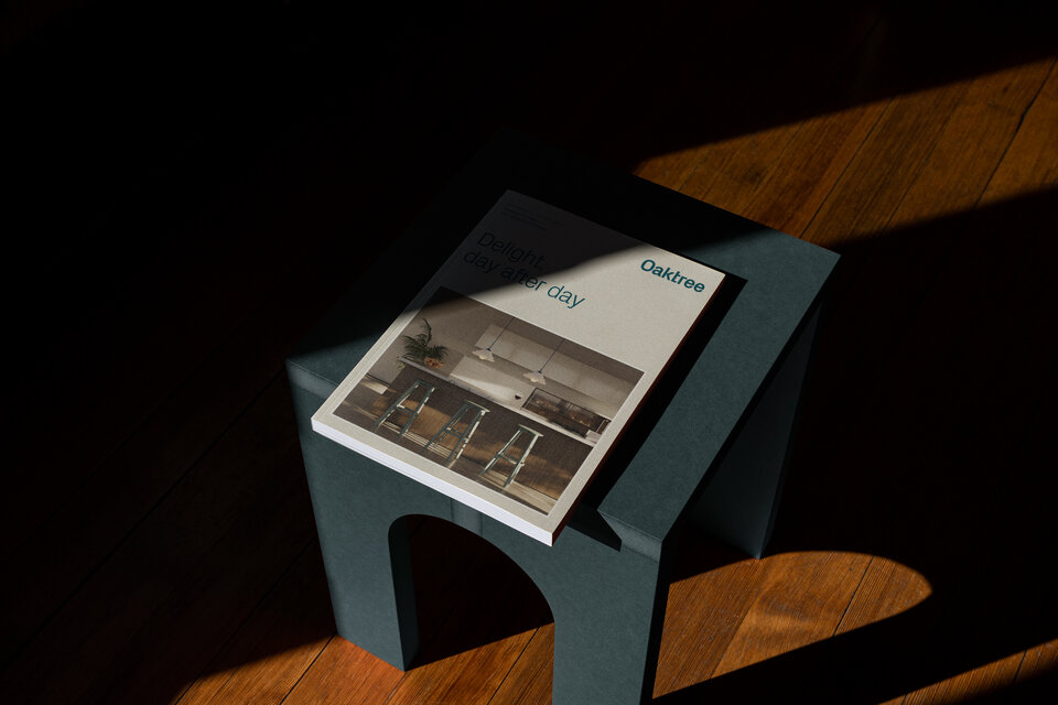
Delight, day after day
Client
Oaktree
Date
2024
Location
Bangalore, India
Website
Services Provided
Sector
Bangalore based Oaktree create products that look beautiful, of course. But more than that, they make your life better. Design-led high-end kitchens and wardrobes that solve problems before you know you have them. Everything in its place. A flawless finish.
In a market saturated with Northern European minimalism, Oaktree stand out for their warmth and humanity. Designed to reflect these qualities we created a new brand from the ground up. We took a holistic approach to all aspects of the project ensuring every touch-point, from the identity system and digital platform all the way through to content and uniforms, was bathed in the Oaktree glow.
01
A dramatic top to bottom re-positioning of Oaktree at the high end of the market.
02
A more clearly defined and differentiated offer has led to increased conversions.
03
Investment in CGI content has delivered efficiency gains through a strategic approach.
Brand
Our new visual identity takes the contrasting qualities of a well rounded customer service approach and the hard edged precision of the manufacturing process. A single typeface forms the basis of the design system with a logotype and Acorn marque functioning as primary components. Whilst the acorn may seem like an obvious choice the symbolism is reflective of family and growth, ideas at the very heart of the Oaktree offer.
A warm and welcoming colour palette shuns the standard monochrome approach within this sector in favour of tones inspired by the origins of the product and the people who make it.
An infinitely flexible pattern reinforces the connection to India but also speaks of journeys through space and the expert re-configuration and management of zones. The hard edges of the home against the flow of human interaction.


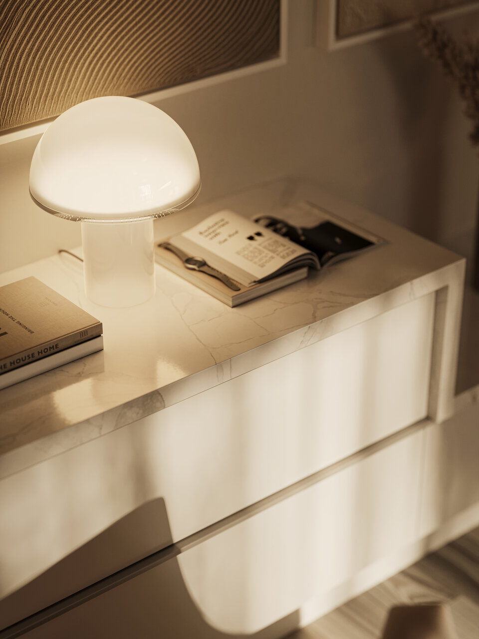
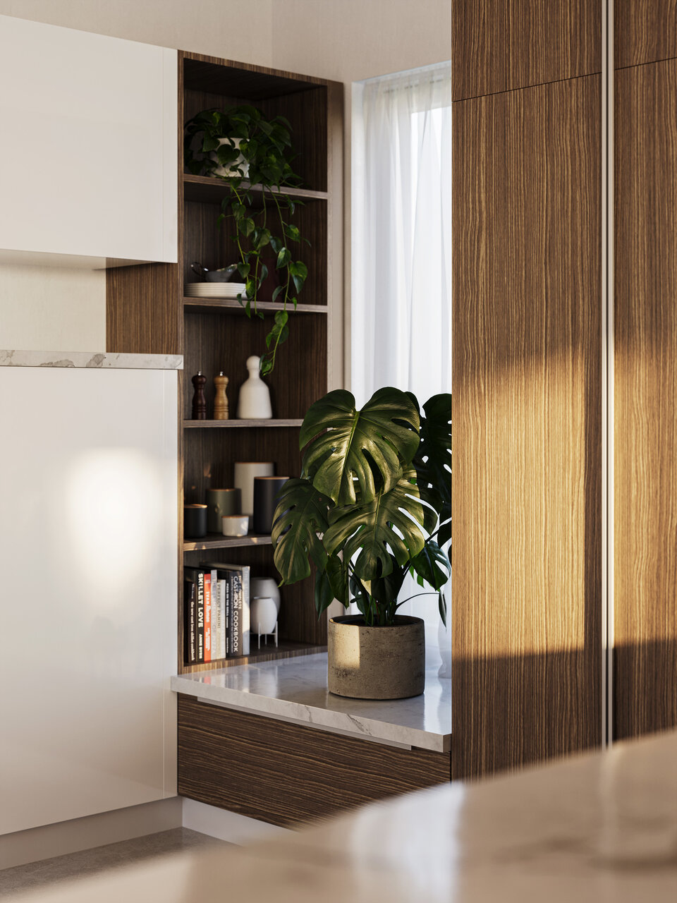
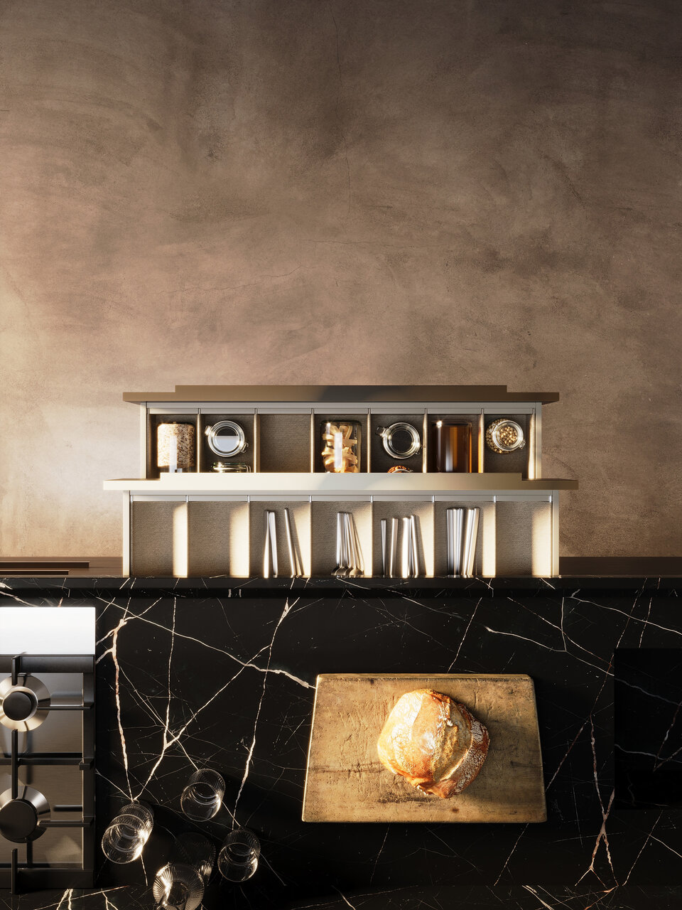
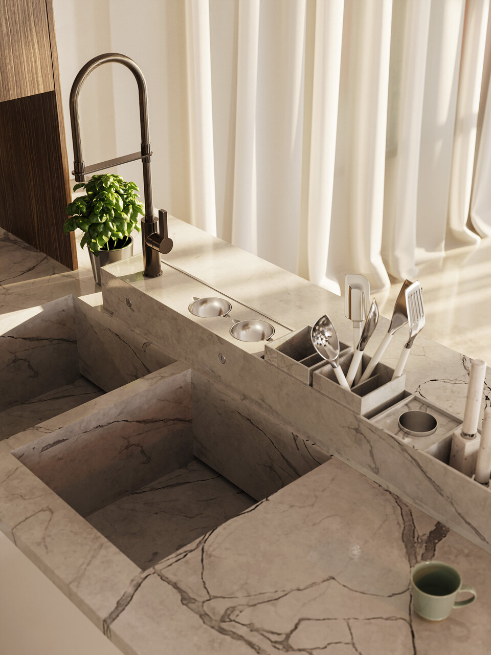
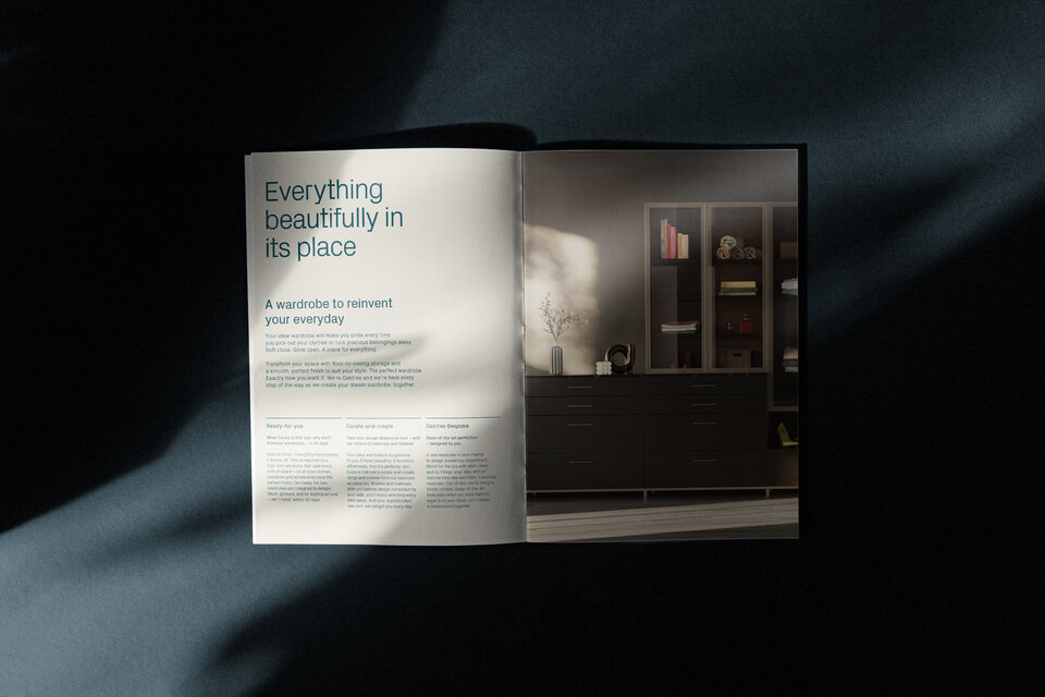
Content
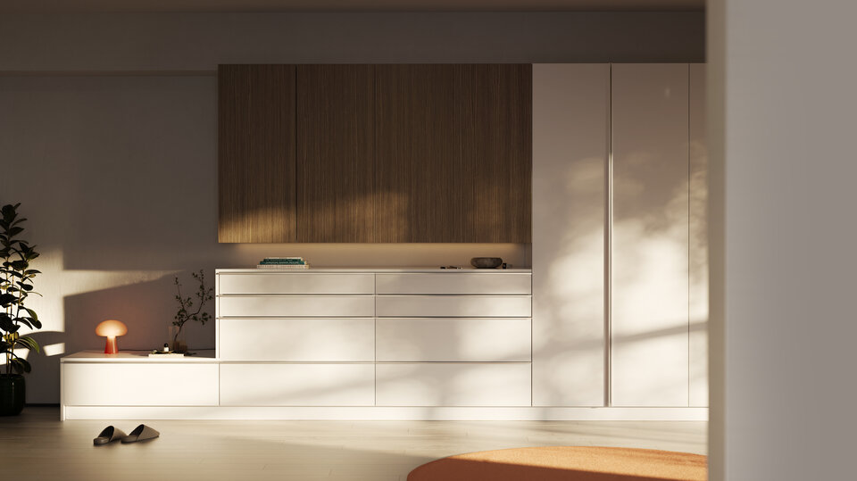
High quality CGI imagery reflects the many and varied possibilities of the Oaktree product. A sense of real life human habitation was important as well as the expression of quality and attention to detail.
Spaces needed to provide enough context to fuel the imagination but not so much that they became prescriptive.


“
My words don’t do justice to the great work Graphical House has done for Oaktree.
Aravind Kashyap
Managing Director, Oaktree
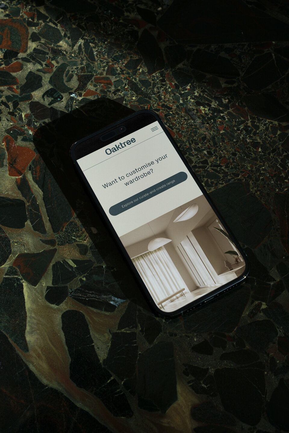
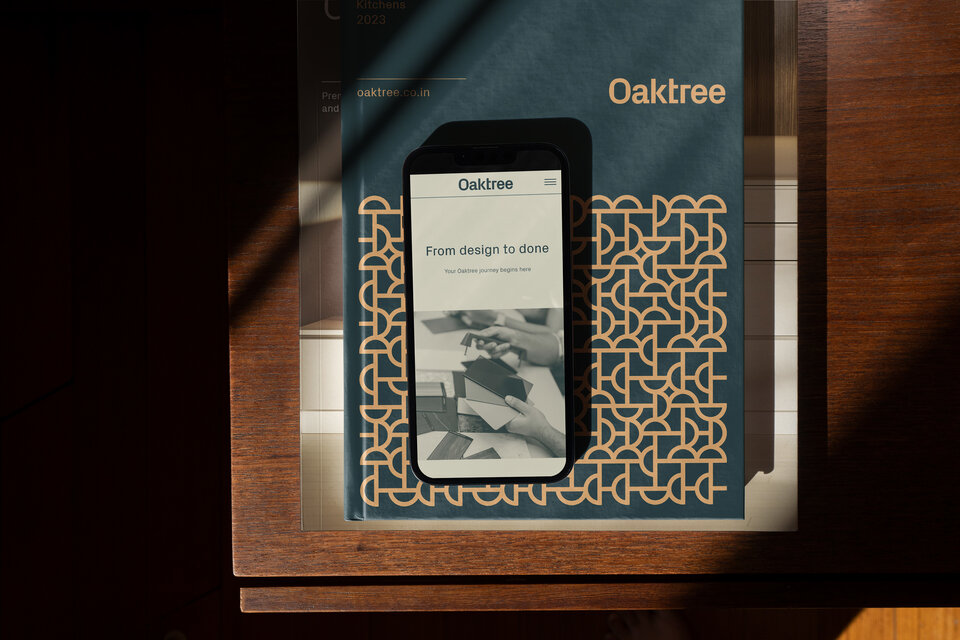
Digital
A well considered and thoughtful digital experience was essential to maintain the continuity of the customer journey. The website offers an intriguing glimpse of the possibilities available to the Oaktree customer.
Intuitive functionality combines with the rich content to provide an insight into the Oaktree experience as well as design inspiration and insight. The full depth of knowledge the Oaktree team.

Collateral
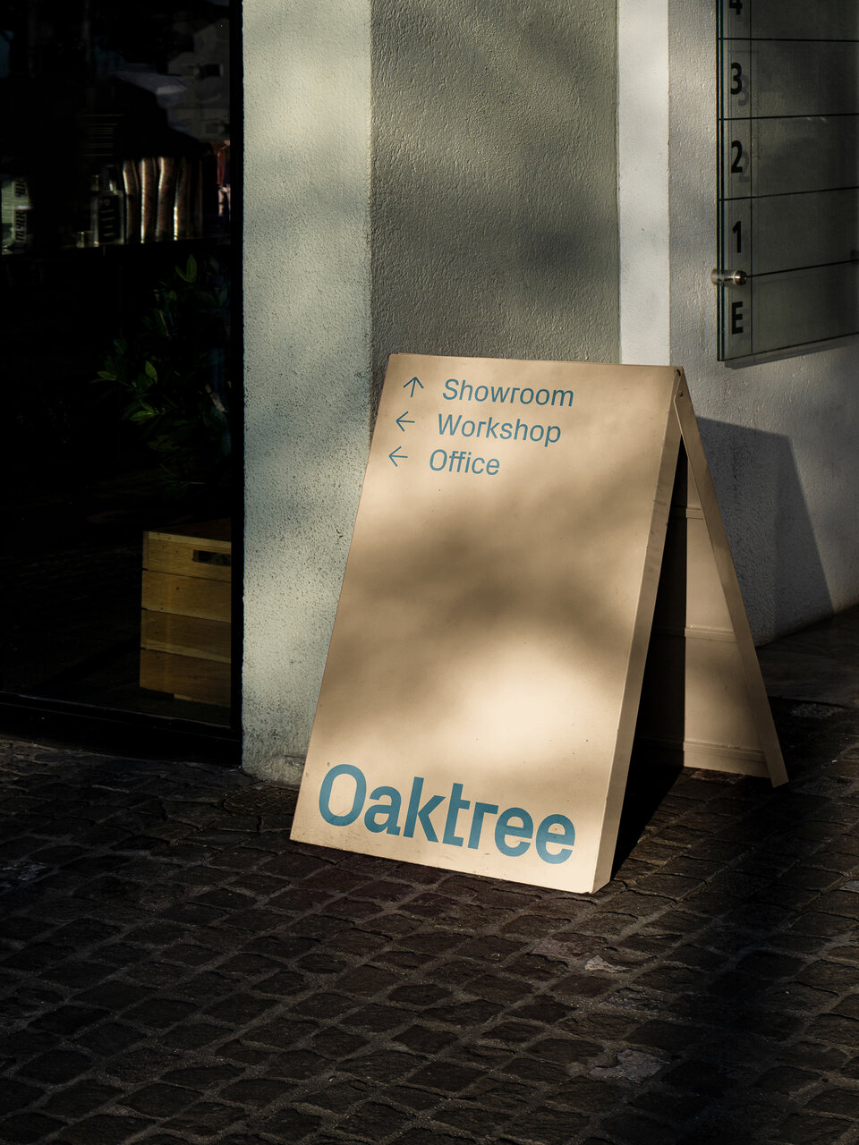
The Oaktree brand has been rolled out extensively across all touch points from promotional collateral to vehicle liveries, uniforms and signage.

“
I feel the journey of our brand has just begun. Personally, it has always been a fight between wishful thinking and what is realistically possible, Graphical House helped me find my balance. Their work goes beyond branding and positively impacts our overall business, a knowledge that guides us so beautifully. It is beauty with a purpose. I am looking forward to many more wonderful things together.
Aravind Kashyap
Managing Director
